This is entitled The Cost of Freedom, painted on the Upper Deck restaurant in Virginia Beach, VA. It is 2 stories high and shows modern soldiers carrying a wounded comrade, with shadowy figures representing wars from America's past. Although it is a very nice mural, I feel that having the "menu board" in the middle of the painting, detracts from it. I guess you have to work with what you have!
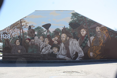
This second one represents the Battle of Great Bridge, from the Revolutionary War, and is located in Chesapeake VA.
Linking to Monday Murals.


21 comments:
These are always so amazing. What a treasure your area of our world has....simply amazing.
Great mural. I don't mind it having the menu board included.
checking out Judy's specials in the middle of an air rescue doesn't seem right at all!
I'd be interested in the story of the second mural - especially why those two on the right aren't looking very happy.
I have a lot of respect for military personnel.
I really need to get to these areas, so I can see these murals!
I think I mentioned to you that we'll soon have one in Smithfield! YAY!
I'm with you and VioletSky on the menu location, Linda. And the mural is not one that would stimulate my appetite much, although well painted. Same with the second mural, so well done, but not a very cheerful subject; glad I don't have to look at it every day. Both are perfect for the meme, of course. :-)
[Re my ad mural: alhough Kaiping is near HK (about three hours south), that would not explain the English on the jar of cream; no one except the rare returning overseas Chinese here speak English. It is just to give the product a foreign allure, regardless of where it was made. LOL!]
These murals are wonderful...may we never forget some of the battles that happened for the sake of our freedom. I agee with the menue board on the first one..very distracting!
It's a great mural, but it would look so much more significant if it was on a wall all to itself.That menu board would look heaps better with something edible around it, or a cafe scene or something. It's sometimes hard to figure out why things occur the way they do. Well spotted Linda.
so cool to have these in your area. yeah, the menu signage is a bit 'tasteless'
very powerful imageries, especially the first one. i like them both very much.
very powerful imageries, especially the first one. i like them both very much.
I like the whole idea. It is a shame they stuck the menu in the middle of it. What a bunch of hoots they must be.I am trying to get the word out to all blogger friends that I have a new birds blog.
Since I was hacked I had to give up my old user name and the blogs that went with it.
So this is the new birds blog and I hope you can come visit. Birds Birds Birds and Birds
Get rid of the menu I say!
I agree with the previous commenters. This serious topic is undercut by a menu placed in the scene. Maybe they'll rethink it. The images you posted are very compelling. Thanks, Linda, for participating in this week's Monday Mural.
Great reminder of the price that was paid for our freedom
I think both murals are moving and I like them very much. the artist did an excellent job. the marquee placement is curious though. at least it's easy to see the hours. happy day to you Linda.
I don't think I've seen the mural but I remember the Upper Deck from the 70's. :)
Tnanks again for some good memories!
Nice shots!
I agree that they might have chosen a better spot for the menu board....!
Pam (and Sam)
Better placement on the menu board~yes! Beautiful murals Linda. The top one is awesome even with the menu. Love the colors on the last murals.
amazing murals indeed!
Both are wonderful murals, Linda. I do agree with you about the menu board...
Post a Comment